繰り返し線形グラデーション(repeating-linear-gradientタグ)を利用した見出しデザインを用意しました。
repeating-linear-gradientタグとは
構文
repeating-linear-gradient(グラデーションの角度, 開始色 [開始位置], [途中色1 途中位置1,途中色2 途中位置2, ・・・・], 終了色 終了位置);
[]内は省略可能となってます。
グラデーションの経過ポイントを色と位置で指定します。
経過ポイントは複数指定可能なので増やすことでグラデーションパターンが広がります。
そしてこのグラデーションパターンは要素内で繰り返されます。
また、色指定に
rgba(0~255赤, 0~255緑, 0~255青, 0透明~1不透明)
を用いることで、色と透過率変化させることが出来ます。
ベンダープレフィックス
このタグは、ブラウザによって対応できない場合があるので
ベンダープレフィックスを付けて使うことが出来ます。
| ブラウザ | プレフィックス |
|---|---|
| Google Chrome, Safari | -webkit- |
| Internet Explorer | -ms- |
| Firefox | -moz- |
| Opera | -o- |
【使用方法】
プレフィックス + タグ
【使用例】
-webkit-repeating-linear-gradient(~
-ms-repeating-linear-gradient(~
-moz-repeating-linear-gradient(~
-o-repeating-linear-gradient(~
コピペで簡単見出しデザイン
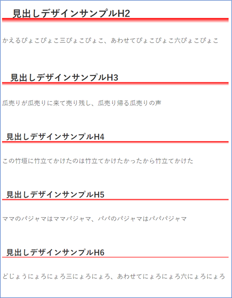
縦グラデーションバー
表示サンプル
コード
.article h2 {
    position: relative;
    background-color: transparent;
    width: 100%;
    border: none;
    padding-bottom: 0.6em;
    background: repeating-linear-gradient(-90deg, rgba(255,0,0,0), rgba(255,0,0,0) 2.1em, rgba(255,0,0,1) 2.1em, rgba(255,0,0,0) 2.6em);
    background: -webkit-repeating-linear-gradient(-90deg, rgba(255,0,0,0), rgba(255,0,0,0) 2.1em, rgba(255,0,0,1) 2.1em, rgba(255,0,0,0) 2.6em);
}
.article h3 {
    position: relative;
    background-color: transparent;
    width: 100%;
    border: none;
    padding-bottom: 0.6em;
    background: repeating-linear-gradient(-90deg, rgba(255,0,0,0), rgba(255,0,0,0) 1.6em, rgba(255,0,0,1) 1.6em, rgba(255,0,0,0) 2.0em);
    background: -webkit-repeating-linear-gradient(-90deg, rgba(255,0,0,0), rgba(255,0,0,0) 1.6em, rgba(255,0,0,1) 1.6em, rgba(255,0,0,0) 2.0em);
}
.article h4 {
    position: relative;
    background-color: transparent;
    width: 100%;
    border: none;
    padding-bottom: 0.6em;
    background: repeating-linear-gradient(-90deg, rgba(255,0,0,0), rgba(255,0,0,0) 1.6em, rgba(255,0,0,1) 1.6em, rgba(255,0,0,0) 1.9em);
    background: -webkit-repeating-linear-gradient(-90deg, rgba(255,0,0,0), rgba(255,0,0,0) 1.6em, rgba(255,0,0,1) 1.6em, rgba(255,0,0,0) 1.9em);
}
.article h5 {
    position: relative;
    background-color: transparent;
    width: 100%;
    border: none;
    padding-bottom: 0.6em;
    background: repeating-linear-gradient(-90deg, rgba(255,0,0,0), rgba(255,0,0,0) 1.6em, rgba(255,0,0,1) 1.6em, rgba(255,0,0,0) 1.8em);
    background: -webkit-repeating-linear-gradient(-90deg, rgba(255,0,0,0), rgba(255,0,0,0) 1.6em, rgba(255,0,0,1) 1.6em, rgba(255,0,0,0) 1.8em);
}
.article h6 {
    position: relative;
    background-color: transparent;
    width: 100%;
    border: none;
    padding-bottom: 0.6em;
    background: repeating-linear-gradient(-90deg, rgba(255,0,0,0), rgba(255,0,0,0) 1.6em, rgba(255,0,0,1) 1.6em, rgba(255,0,0,0) 1.7em);
    background: -webkit-repeating-linear-gradient(-90deg, rgba(255,0,0,0), rgba(255,0,0,0) 1.6em, rgba(255,0,0,1) 1.6em, rgba(255,0,0,0) 1.7em);
}
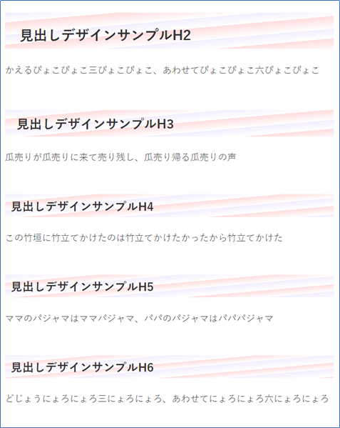
背景フルデザインタイプ
表示サンプル
コード
.article h2 {
    position: relative;
    background-color: transparent;
    width: 100%;
    border: none;
    padding-bottom: 0.3em;
    background: repeating-linear-gradient(-85deg, rgba(243,238,255,1), rgba(255,221,221,0) 0.7em, rgba(255,221,221,1) 0.7em, rgba(255,221,221,0) 1.6em);
    background: -webkit-repeating-linear-gradient(-85deg, rgba(243,238,255,1), rgba(255,221,221,0) 0.7em, rgba(255,221,221,1) 0.7em, rgba(255,221,221,0) 1.6em);
}
.article h3 {
    position: relative;
    background-color: transparent;
    width: 100%;
    border: none;
    padding-bottom: 0.3em;
    background: repeating-linear-gradient(-85deg, rgba(243,238,255,1), rgba(255,221,221,0) 0.7em, rgba(255,221,221,1) 0.7em, rgba(255,221,221,0) 1.5em);
    background: -webkit-repeating-linear-gradient(-85deg, rgba(243,238,255,1), rgba(255,221,221,0) 0.7em, rgba(255,221,221,1) 0.7em, rgba(255,221,221,0) 1.5em);
}
.article h4 {
    position: relative;
    background-color: transparent;
    width: 100%;
    border: none;
    padding-bottom: 0.3em;
    background: repeating-linear-gradient(-85deg, rgba(243,238,255,1), rgba(255,221,221,0) 0.7em, rgba(255,221,221,1) 0.7em, rgba(255,221,221,0) 1.4em);
    background: -webkit-repeating-linear-gradient(-85deg, rgba(243,238,255,1), rgba(255,221,221,0) 0.7em, rgba(255,221,221,1) 0.7em, rgba(255,221,221,0) 1.5em);
}
.article h5 {
    position: relative;
    background-color: transparent;
    width: 100%;
    border: none;
    padding-bottom: 0.3em;
    background: repeating-linear-gradient(-85deg, rgba(243,238,255,1), rgba(255,221,221,0) 0.7em, rgba(255,221,221,1) 0.7em, rgba(255,221,221,0) 1.3em);
    background: -webkit-repeating-linear-gradient(-85deg, rgba(243,238,255,1), rgba(255,221,221,0) 0.7em, rgba(255,221,221,1) 0.7em, rgba(255,221,221,0) 1.3em);
}
.article h6 {
    position: relative;
    background-color: transparent;
    width: 100%;
    border: none;
    padding-bottom: 0.3em;
    background: repeating-linear-gradient(-85deg, rgba(243,238,255,1), rgba(255,221,221,0) 0.7em, rgba(255,221,221,1) 0.7em, rgba(255,221,221,0) 1.2em);
    background: -webkit-repeating-linear-gradient(-85deg, rgba(243,238,255,1), rgba(255,221,221,0) 0.7em, rgba(255,221,221,1) 0.7em, rgba(255,221,221,0) 1.2em);
}
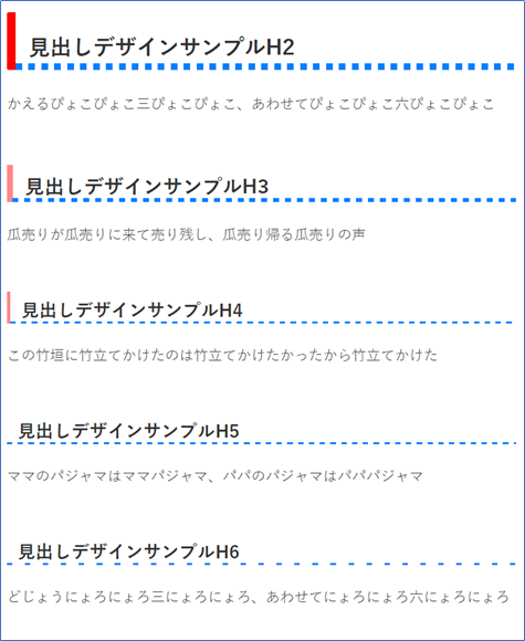
くっきりシンプルデザインタイプ
表示サンプル
コード
.article h2 {
    position: relative;
    background-color: transparent;
    padding-left: .6em;
    padding-bottom: .4em;
    border-top: none;
    border-right: none;
    border-bottom: none;
    border-left: solid .4em #ff0000;
}
.article h2:after {
    content: "";
    position: absolute;
    left: 0;
    bottom: 0;
    width: 100%;
    height: .3em;
    background: repeating-linear-gradient(-0deg, rgba(0,127,255,1), rgba(0,127,255,1) 0.3em, rgba(0,127,255,0) 0.3em, rgba(0,127,255,0) 0.6em);
    background: -webkit-repeating-linear-gradient(-0deg, rgba(0,127,255,1), rgba(0,127,255,1) 0.3em, rgba(0,127,255,0) 0.3em, rgba(0,127,255,0) 0.6em);
}
.article h3 {
    position: relative;
    background-color: transparent;
    padding-left: .6em;
    padding-bottom: .1em;
    border-top: none;
    border-right: none;
    border-bottom: none;
    border-left: solid .3em #ff8888;
}
.article h3:after {
    content: "";
    position: absolute;
    left: 0;
    bottom: 0;
    width: 100%;
    height: .2em;
    background: repeating-linear-gradient(-0deg, rgba(0,127,255,1), rgba(0,127,255,1) 0.3em, rgba(0,127,255,0) 0.3em, rgba(0,127,255,0) 0.6em);
    background: -webkit-repeating-linear-gradient(-0deg, rgba(0,127,255,1), rgba(0,127,255,1) 0.3em, rgba(0,127,255,0) 0.3em, rgba(0,127,255,0) 0.6em);
}
.article h4 {
    position: relative;
    background-color: transparent;
    padding-left: .6em;
    padding-bottom: .1em;
    border-top: none;
    border-right: none;
    border-bottom: none;
    border-left: solid .2em #ff8888;
}
.article h4:after {
    content: "";
    position: absolute;
    left: 0;
    bottom: 0;
    width: 100%;
    height: .1em;
    background: repeating-linear-gradient(-0deg, rgba(0,127,255,1), rgb(0,127,255,1) 0.3em, rgba(0,127,255,0) 0.3em, rgba(0,127,255,0) 0.6em);
    background: -webkit-repeating-linear-gradient(-0deg, rgba(0,127,255,1), rgb(0,127,255,1) 0.3em, rgba(0,127,255,0) 0.3em, rgba(0,127,255,0) 0.6em);
}
.article h5 {
    position: relative;
    background-color: transparent;
    padding-left: .6em;
    padding-bottom: .1em;
    border-top: none;
    border-right: none;
    border-bottom: none;
    border-left: none;
}
.article h5:after {
    content: "";
    position: absolute;
    left: 0;
    bottom: 0;
    width: 100%;
    height: .1em;
    background: repeating-linear-gradient(-0deg, rgba(0,127,255,1), rgba(0,127,255,1) 0.3em, rgba(0,127,255,0) 0.3em, rgba(0,127,255,0) 0.6em);
    background: -webkit-repeating-linear-gradient(-0deg, rgba(0,127,255,1), rgba(0,127,255,1) 0.3em, rgba(0,127,255,0) 0.3em, rgba(0,127,255,0) 0.6em);
}
.article h6 {
    position: relative;
    background-color: transparent;
    padding-left: .6em;
    padding-bottom: .1em;
    border-top: none;
    border-right: none;
    border-bottom: none;
    border-left: none;
}
.article h6:after {
    content: "";
    position: absolute;
    left: 0;
    bottom: 0;
    width: 100%;
    height: .1em;
    background: repeating-linear-gradient(-0deg, rgba(0,127,255,1), rgba(0,127,255,1) 0.3em, rgba(0,127,255,0) 0.3em, rgba(0,127,255,0) 1.0em);
    background: -webkit-repeating-linear-gradient(-0deg, rgba(0,127,255,1), rgba(0,127,255,1) 0.3em, rgba(0,127,255,0) 0.3em, rgba(0,127,255,0) 1.0em);
}
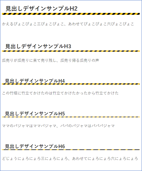
警告色?デザインタイプ
表示サンプル
コード
.article h2 {
    position: relative;
    background-color: transparent;
    padding-left: .6em;
    padding-bottom: .4em;
    border-top: none;
    border-right: none;
    border-bottom: none;
    border-left: none;
}
.article h2:after {
    content: "";
    position: absolute;
    left: 0;
    bottom: 0;
    width: 100%;
    height: .3em;
    background: repeating-linear-gradient(-45deg, rgba(255,196,0,1), rgba(255,196,0,1) 0.3em, rgba(0,0,0,1) 0.3em, rgba(0,0,0,1) 0.6em);
    background: -webkit-repeating-linear-gradient(-45deg, rgba(255,196,0,1), rgba(255,196,0,1) 0.3em, rgba(0,0,0,1) 0.3em, rgba(0,0,0,1) 0.6em);
}
.article h3 {
    position: relative;
    background-color: transparent;
    padding-left: .6em;
    padding-bottom: .3em;
    border-top: none;
    border-right: none;
    border-bottom: none;
    border-left: none;
}
.article h3:after {
    content: "";
    position: absolute;
    left: 0;
    bottom: 0;
    width: 100%;
    height: .2em;
    background: repeating-linear-gradient(-45deg, rgba(255,196,0,1), rgba(255,196,0,1) 0.3em, rgba(0,0,0,1) 0.3em, rgba(0,0,0,1) 0.6em);
    background: -webkit-repeating-linear-gradient(-45deg, rgba(255,196,0,1), rgba(255,196,0,1) 0.3em, rgba(0,0,0,1) 0.3em, rgba(0,0,0,1) 0.6em);
}
.article h4 {
    position: relative;
    background-color: transparent;
    padding-left: .6em;
    padding-bottom: .1em;
    border-top: none;
    border-right: none;
    border-bottom: none;
    border-left: none;
}
.article h4:after {
    content: "";
    position: absolute;
    left: 0;
    bottom: 0;
    width: 100%;
    height: .2em;
    background: repeating-linear-gradient(-45deg, rgba(255,196,0,1), rgba(255,196,0,1) 0.3em, rgba(0,0,0,1) 0.3em, rgba(0,0,0,1) 0.6em);
    background: -webkit-repeating-linear-gradient(-45deg, rgba(255,196,0,1), rgba(255,196,0,1) 0.3em, rgba(0,0,0,1) 0.3em, rgba(0,0,0,1) 0.6em);
}
.article h5 {
    position: relative;
    background-color: transparent;
    padding-left: .6em;
    padding-bottom: .1em;
    border-top: none;
    border-right: none;
    border-bottom: none;
    border-left: none;
}
.article h5:after {
    content: "";
    position: absolute;
    left: 0;
    bottom: 0;
    width: 100%;
    height: .1em;
    background: repeating-linear-gradient(-45deg, rgba(255,196,0,1), rgba(255,196,0,1) 0.3em, rgba(0,0,0,1) 0.3em, rgba(0,0,0,1) 0.6em);
    background: -webkit-repeating-linear-gradient(-45deg, rgba(255,196,0,1), rgba(255,196,0,1) 0.3em, rgba(0,0,0,1) 0.3em, rgba(0,0,0,1) 0.6em);
}
.article h6 {
    position: relative;
    background-color: transparent;
    padding-left: .6em;
    padding-bottom: .1em;
    border-top: none;
    border-right: none;
    border-bottom: none;
    border-left: none;
}
.article h6:after {
    content: "";
    position: absolute;
    left: 0;
    bottom: 0;
    width: 100%;
    height: .1em;
    background: repeating-linear-gradient(-45deg, rgba(255,196,0,1), rgba(255,196,0,1) 0.3em, rgba(0,0,0,1) 0.3em, rgba(0,0,0,1) 1.0em);
    background: -webkit-repeating-linear-gradient(-45deg, rgba(255,196,0,1), rgba(255,196,0,1) 0.3em, rgba(0,0,0,1) 0.3em, rgba(0,0,0,1) 1.0em);
}
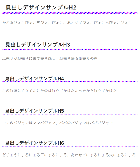
カラフルデザインタイプ
表示サンプル
コード
.article h2 {
    position: relative;
    background-color: transparent;
    padding-left: .6em;
    padding-bottom: .4em;
    border-top: none;
    border-right: none;
    border-bottom: none;
    border-left: none;
}
.article h2:after {
    content: "";
    position: absolute;
    left: 0;
    bottom: 0;
    width: 100%;
    height: .3em;
    background: repeating-linear-gradient(-45deg, rgba(0,0,255,1), rgba(0,0,255,1) 2px, rgba(255,255,255,1) 2px,rgba(255,255,255,1) 4px,  rgba(255,0,255,1) 4px, rgba(255,0,255,1) 6px, rgba(255,255,255,1) 6px,rgba(255,255,255,1) 8px);
    background: -webkit-repeating-linear-gradient(-45deg, rgba(0,0,255,1), rgba(0,0,255,1) 2px, rgba(255,255,255,1) 2px,rgba(255,255,255,1) 4px,  rgba(255,0,255,1) 4px, rgba(255,0,255,1) 6px, rgba(255,255,255,1) 6px,rgba(255,255,255,1) 8px);
}
.article h3 {
    position: relative;
    background-color: transparent;
    padding-left: .6em;
    padding-bottom: .3em;
    border-top: none;
    border-right: none;
    border-bottom: none;
    border-left: none;
}
.article h3:after {
    content: "";
    position: absolute;
    left: 0;
    bottom: 0;
    width: 100%;
    height: .2em;
    background: repeating-linear-gradient(-45deg, rgba(0,0,255,1), rgba(0,0,255,1) 2px, rgba(255,255,255,1) 2px,rgba(255,255,255,1) 4px,  rgba(255,0,255,1) 4px, rgba(255,0,255,1) 6px, rgba(255,255,255,1) 6px,rgba(255,255,255,1) 8px);
    background: -webkit-repeating-linear-gradient(-45deg, rgba(0,0,255,1), rgba(0,0,255,1) 2px, rgba(255,255,255,1) 2px,rgba(255,255,255,1) 4px,  rgba(255,0,255,1) 4px, rgba(255,0,255,1) 6px, rgba(255,255,255,1) 6px,rgba(255,255,255,1) 8px);
}
.article h4 {
    position: relative;
    background-color: transparent;
    padding-left: .6em;
    padding-bottom: .1em;
    border-top: none;
    border-right: none;
    border-bottom: none;
    border-left: none;
}
.article h4:after {
    content: "";
    position: absolute;
    left: 0;
    bottom: 0;
    width: 100%;
    height: .2em;
    background: repeating-linear-gradient(-45deg, rgba(0,0,255,1), rgba(0,0,255,1) 2px, rgba(255,255,255,1) 2px,rgba(255,255,255,1) 4px,  rgba(255,0,255,1) 4px, rgba(255,0,255,1) 6px, rgba(255,255,255,1) 6px,rgba(255,255,255,1) 8px);
    background: -webkit-repeating-linear-gradient(-45deg, rgba(0,0,255,1), rgba(0,0,255,1) 2px, rgba(255,255,255,1) 2px,rgba(255,255,255,1) 4px,  rgba(255,0,255,1) 4px, rgba(255,0,255,1) 6px, rgba(255,255,255,1) 6px,rgba(255,255,255,1) 8px);
}
.article h5 {
    position: relative;
    background-color: transparent;
    padding-left: .6em;
    padding-bottom: .1em;
    border-top: none;
    border-right: none;
    border-bottom: none;
    border-left: none;
}
.article h5:after {
    content: "";
    position: absolute;
    left: 0;
    bottom: 0;
    width: 100%;
    height: .1em;
    background: repeating-linear-gradient(-45deg, rgba(0,0,255,1), rgba(0,0,255,1) 2px, rgba(255,255,255,1) 2px,rgba(255,255,255,1) 4px,  rgba(255,0,255,1) 4px, rgba(255,0,255,1) 6px, rgba(255,255,255,1) 6px,rgba(255,255,255,1) 8px);
    background: -webkit-repeating-linear-gradient(-45deg, rgba(0,0,255,1), rgba(0,0,255,1) 2px, rgba(255,255,255,1) 2px,rgba(255,255,255,1) 4px,  rgba(255,0,255,1) 4px, rgba(255,0,255,1) 6px, rgba(255,255,255,1) 6px,rgba(255,255,255,1) 8px);
}
.article h6 {
    position: relative;
    background-color: transparent;
    padding-left: .6em;
    padding-bottom: .1em;
    border-top: none;
    border-right: none;
    border-bottom: none;
    border-left: none;
}
.article h6:after {
    content: "";
    position: absolute;
    left: 0;
    bottom: 0;
    width: 100%;
    height: .05em;
    background: repeating-linear-gradient(-45deg, rgba(0,0,255,1), rgba(0,0,255,1) 2px, rgba(255,255,255,1) 2px,rgba(255,255,255,1) 4px,  rgba(255,0,255,1) 4px, rgba(255,0,255,1) 6px, rgba(255,255,255,1) 6px,rgba(255,255,255,1) 8px);
    background: -webkit-repeating-linear-gradient(-45deg, rgba(0,0,255,1), rgba(0,0,255,1) 2px, rgba(255,255,255,1) 2px,rgba(255,255,255,1) 4px,  rgba(255,0,255,1) 4px, rgba(255,0,255,1) 6px, rgba(255,255,255,1) 6px,rgba(255,255,255,1) 8px);
}
見出しデザインまとめ
繰り返し線形グラデーション(repeating-linear-gradientタグ)を利用した見出しデザインを数点紹介しましたが、
角度、グラデーションパターンとパラメータが豊富なので色々変えてみると、
思いもよらないデザインにめぐり逢えるので楽しいです。
コピペして、ちょっと手を加えると新たな発見があるかもしれません。